Heuristic Evaluation
Completed Heuristic Evaluation
-
Heuristic Rule Violated: Rule 8 - Aesthetic and minimalist design
Severity Level: 3
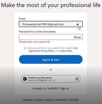
On the first ‘sign up’ page, it has a form to enter your email address. There is a drop-down arrow on this form, but clicking it does nothing.
-
Heuristic Rule Violated: Rule 5 - Error prevention
Severity Level: 3

On the first ‘sign up’ page, the second form simply says “Password (6 or more characters)”. This does not do a good job of indicating that this entry is for the new LinkedIn account password. A user might accidentally enter their email password, since that is the only other form on the page, and it just feels right for the situation.
-
Heuristic Rule Violated: Rule 4 - Consistency and standards
Severity Level: 3

When creating an account on other sites, there are usually two password fields – one for the password, and another to confirm the password. Here there is only one.
-
Heuristic Rule Violated: Rule 10 - Help and documentation
Severity Level: 2

The LinkedIn User Agreement, Privacy Policy, and Cookie Policy are linked, but it is unlikely that a user will click on these, since the user knows that it will open up a long document of legal jargon. LinkedIn should provide a general summary of these documents so that users are more likely to at least glance at the policies they are agreeing to.
-
Heuristic Rule Violated: Rule 1 - Visibility of system status
Severity Level: 2
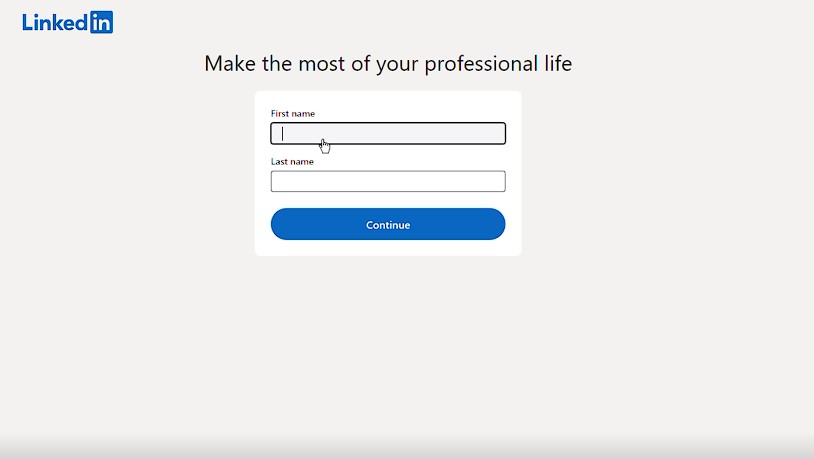
There are several screens that a user must progress through to sign up for a LinkedIn account. There is no indication of how many screens they will need to get through to complete this process.
-
Heuristic Rule Violated: Rule 3 - User control and freedom
Severity Level: 3

There is no way to return to the previous screen to change something the user previously entered. When clicking the back button on the web browser, it returns to the last screen of inputs, but all of the fields that were previously filled out are now empty again.
-
Heuristic Rule Violated: Rule 6 - Recognition rather than recall
Severity Level: 3
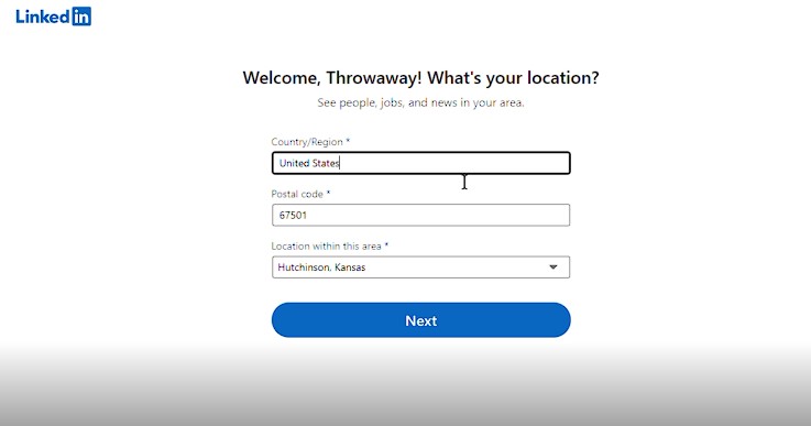
There are asterisks on the labels for certain fields. It is unclear what these asterisks mean, since there is virtually nothing else on the screen besides the logo, the title of the form, the fields, and the next button. The asterisks may indicate that the fields are required, but if so, they should have at least stated this on the first screen that uses forms with asterisks, if not all of them.
-
Heuristic Rule Violated: Rule 7 - Flexibility and efficiency of use
Severity Level: 2
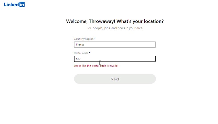
To set your location, you must have a postal code, no matter what. You can search and select regions or countries, but you can’t select a location within that area until you type a valid postal code.
-
Heuristic Rule Violated: Rule 7 - Flexibility and efficiency of use
Severity Level: 3
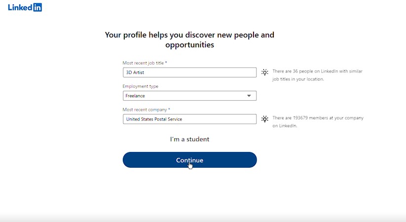

When adding your most recent job title, you can either enter your job information, or enter your student information. This is restricted in this way because there is a button on the screen that says, “I’m a student”, or “I’m not a student” after clicking it. Most people who are students are also forced to work jobs to pay for their schooling, so this shows a disconnect.
-
Heuristic Rule Violated: Rule 4 - Consistency and standards
Severity Level: 1
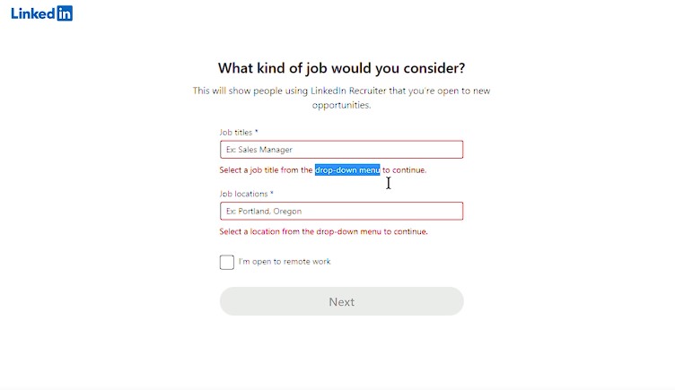
On the screen to select what kind of job you would consider, it says to select a job title from the drop-down menu to continue. However, there is no drop-down menu until the user enters at least one letter. This can be confusing and make the user hesitate.
-
Heuristic Rule Violated: Rule 6 - Recognition rather than recall
Severity Level: 2
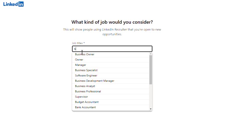
When entering what kinds of jobs you would consider, the user must enter at least one letter into the field before a dropdown list of options shows up. It might be easier for a user to decide if they can see the list of options without having to enter something first.
-
Heuristic Rule Violated: Rule 2 - Match between system and the real world
Severity Level: 2

The dropdown list of options for jobs you would consider doesn’t even correspond to the letter the user entered into the field. There are options listed that do not have any of the letters that the user typed in.
-
Heuristic Rule Violated: Rule 3 - User control and freedom
Severity Level: 2
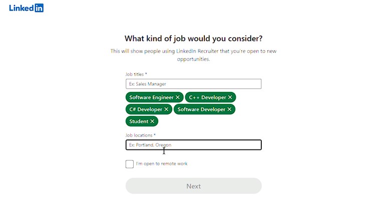
You can only add up to 5 job titles to the list of jobs you would consider – this number may be a bit low.
-
Heuristic Rule Violated: Rule 4 - Consistency and standards
Severity Level: 1

Some of the job titles listed include “Student” and “Unemployed”. These likely don’t belong on this list for jobs you would consider. They may have been carried over due to the fact that the list is the same as the list of jobs a user can choose for their current or previous job elsewhere on the site.
-
Heuristic Rule Violated: Rule 2 - Match between system and the real world
Severity Level: 1
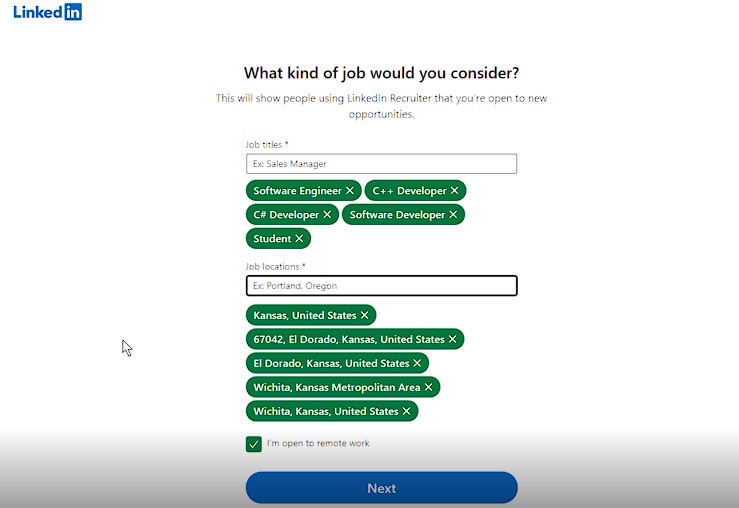
In the list for job locations on the same screen, there are several different listings for the same locations. There are two listings for El Dorado, KS, with one including the zip code and the other omitting it, and two locations for Wichita, KS, one being the metropolitan area. This may be confusing to users.
-
Heuristic Rule Violated: Rule 3 - User control and freedom
Severity Level: 2
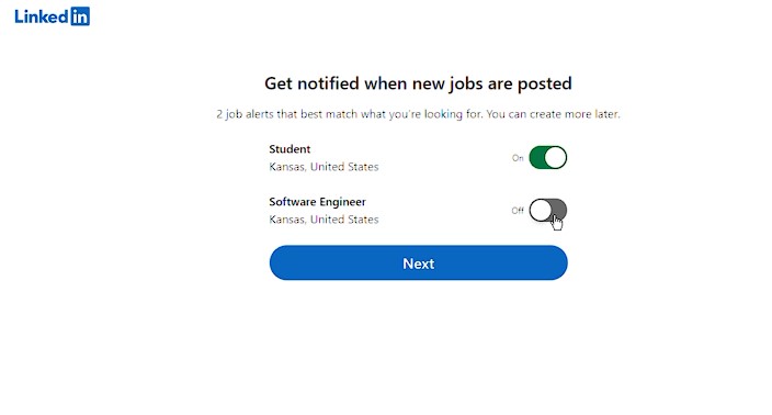
On the screen where you can choose to get notified when new jobs are posted for certain jobs that the user said that they were interested in on the previous screen, there are only two of the jobs listed to turn on notifications. Since the user is restricted to only selecting 5 jobs on the job interest screen, why not just include notification choices for all 5 of the jobs, instead of only listing 2?
-
Heuristic Rule Violated: Rule 1 - Visibility of system status
Severity Level: 3

On the screen that lists organizations, courses, and other content that the user can follow, it lists “Popular courses for 3D Artist at United States Postal Service” (due to what I entered on the account creation). However, the items listed here do not seem to have anything to do with 3D Art, or USPS, in any way. It seems like these are general ‘communication’ type courses that would likely be recommended to every new user, regardless of their personal details.
-
Heuristic Rule Violated: Rule 8 - Aesthetic and minimalist design
Severity Level: 3
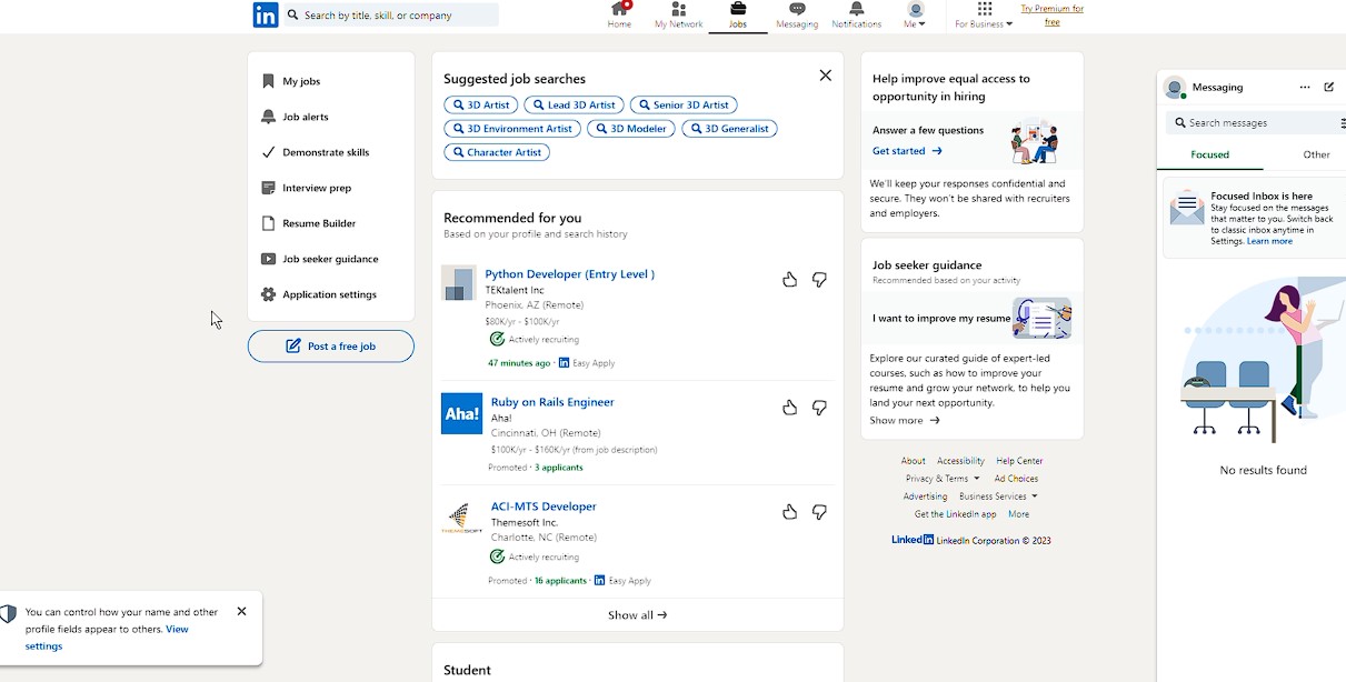
Upon finishing the account creation process, the user is met with a very busy screen. There is a lot to take in at this moment, and there is no clear indication or highlight of where to go first.
Summary of Issues Identified
Based on the issues mentioned, it seems that LinkedIn's sign-up process is not very user-friendly. The site has a number of confusing and unclear features, including unclear password instructions, a lack of information about legal policies, and confusing job title and location options. Additionally, the site's notification preferences and content recommendations seem disjointed and poorly tailored to the user's interests. Finally, the site's post-sign-up landing page is cluttered and overwhelming, with no clear direction for the user. Overall, it appears that LinkedIn could benefit from streamlining its sign-up process and improving its user interface to provide a more seamless experience for new users.